Thursday, May 14, 2009

soundride on the long island railroad.


A conductor says while I board the 7:22pm Long Beach Train on a wet Tuesday night,"This is the peak train to Long Beach. This train will stop at Woodside, Jamaica, Valley Stream, Lynbrook, Cold Spring Harbor, and Long Beach. Change at Jamaica for all other destinations. And please be mindful of the gap." I get in. Its relativly quiet for a peak train. I hear the clicks and clacks of the business people and their blackberries. I notice some of them playing brick bracker, or whatever that Blackberry game is called and smiled to myself. I am not an owner of a blackberry, but I've heard my friends talking about the addiction they have for that game. Some seemingly long lost friends catch up awkardly. Discussing old friends that they used to know. Another random coincidence in Manhattan Transit. 
    I hear the squeeky train tracks that continue until we hit my stop: Lynbrook. The doors open and emit a indescribable sound. Sounds something like air and "zvrooooom".  Walking home is usually a quiet experience. Not much happens on the streets of New York's: Long Island. Just the sound of the wind, and sometimes the smell of dinner. On this evening there was a bit of rain trickling down onto the street. I walk with anticipation to get to my house and finally get to my room and relax from a bustling  day in the city. 


Wednesday, April 29, 2009

Design I really like.

A design I never got over how user friendly and welcoming is is the gmail.com interface. If you  have a gmail account you should be familiar with the classic layout it comes with, if not get one now!!! It is so clean and simple to use, yet although it is simple a few high tech and convient styles will make your emailing life so much easier. To start off with it has a colorful and simple fonted logo. 


The "M" in the logo doubling as a letter of the alphabet and a partial outline to an envelop is a witty and charming touch to the logo's already colorful apperance. Then on the top above the logo, very simply, from left to write it has all the things the Gmail account gives you such as a place to store Documents, Photos, Calander events, etc. The makers of this emailing system went the extra mile to make gmail not only a place to exchange webmail but also a place where you can organize your life and keep everything in one managable space.

The background of the interface is white which is soothing to the brain when you realize you have 40 or so emails to catch up on. The Inbox is shown in an transparent blue. The font used all over the site is constant, Sans Serif. The colors generally stay the same in Gmail, either white or the blue. The other quirky plus to having a gmail account is Gchat. Here you get to chat with fellow Gmail members that you are friends with. The Gchat icon is to the middle right of the page and there it has a list as to who is offline, available, busy, and away. A colorful circle to the right of that persons name will indicate what that person chose to be there status. Red indicating they are busy, Green that they are available and Yellow that they are away. Those colors are also the colors of traffic signals so it makes it easier for the most illiterate computer user to understand what is going on. Needless to say get a Gmail account now and see it for yourself, of course if you do not already have one.

Wednesday, April 22, 2009

Design I Like

Media design grabs us and brings us into a creative part of the world. For a media design to be good it must first catch our attention, if it does not do this first task it has failed it's purpose. Of course people have different preferences when it comes to design. Beauty is always in the eye of the beholder. Another important intent of design, as was stressed in my digital media class, was that it helps the viewer organize material mentally. To organize material properly information has to be in the most eye friendly proximity. Allignment is also a vital part of a good design. Designs should follow a train of thought so that the information is clear to the viewer. It must visually connect to each other.

Designs that I like are first of all "clean". By that I mean that they have a clear flow of thoughts and crisp design. A clear font like sans serif, helvetica, or times new roman is perferable. I find that other fonts, such as the blackletter, make it difficult for me to read what the design is displaying. A clean background, preferably white, with a readable font make the information accessible to people. This type of design does not need to be boring and in fact i find it's refreshing in an era of overly graphic design. Also I find that colors can pop out more over a white background.

I will add some pictures of the designs I find appealing. A notable website with this functional design is http://www.google.com/.


Here are some pictures:


Wednesday, March 18, 2009

Annie Leibovitz: Life Through a Lens

Annie Leibovitz is a renowned American photographer, so when I was scrolling through my on demand movies and i saw a documentary available that followed her around and focused on her work over the last couple of decades I immediately knew i was watching it. The documentary was shot in three different ways. The premiere way was with an average pan/ tilt sort of way. It featured cameo's from famous people she had photographed over the years so it was like still shots of people talking about their experiences with Annie. The second way it was shot was with footage from her childhood. Apparently, her mother, Marylin, was heavily involved with documenting their family through mainly video. So the producer and director of the documentary decided it would be useful to use this raw footage of the Leibovitz family, while the kids were young. It was especially interesting because they moved around often and their car was the only constant in their life. Her mother said they "saw the world through a ready made picture frame, which was the frame of the car window, that was how we saw the world". That statement was especially powerful because while she was saying this they rolled their old family footage of them in the car and looking out the window frame. The film was grainy and lacked defined colors and HD pixels like we had to day. It added realness to the documentary as a whole. Showing a renowned media photographer's childhood through older mediums of film making let's the viewers connect the older ways of documenting life and the new way that Annie fully utilizes. The third way they delivered the essence of Annie and her life was through showing her astounding photographs that she took throughout her life: her beginning work, her word at rolling stone, then Vanity Fair, and her later work of her partner and her family. These still shots of her work with the various narrators and interesting stories made the documentary feel very real and it felt like it gave a complete look at the professional and artistic life of Annie. I left the film feeling astounded by the various mediums of art and life documentation. The documentary chose fairly simple ways of delivering the message. No particularly special camera movements and placement. It was a clean film with a direct message of how photography takes a fraction of a minute and heightens reality.


Wednesday, March 4, 2009

Fun film find in Astoria!

Last thursday I had the pleasure of going to The Museum of Moving Images in Astoria, Queens. The museum, which is still under construction, is a sharp mix of the history and current media and film. They have vintage television sets. The tour guides ( they come automatic with entry and are really really helpful) showed my group that in the 1950's the television creators were playing around with the design of tv's. One had four wheels on the bottom and another was in the shape of a circle. They were not sure yet how to get housewives used to this new appliance, so they were trying to make it user friendly. Another really neat home entertainment system had a television, a radio, and a mirror. I personally wish one of those was still around, but I digress.

Besides the cool historical pieces the museum also had fun activities to try and see what it was really like to be an actor on a green-screen, an illustrator/cartoonist, amongst other things. I took a try at making a flip book, you know those books with a bunch of pages and when you flip them really fast they and the still images make it seem as though the subjects in those pictures are moving. That was fun and is just $7 and in color on a regular visit. I also got in front of a green screen and saw myself on a television screen with a crazy background behind me. All in all the museum was quite a fun trip and i'll be making it again with my film enthusiast friends.

Tuesday, February 17, 2009

Welcome

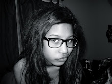
Hello! My name is Shanique Thomas and I'm a 19 year old girl from New York City. Having been suspended from blogging for a short bit of time I'm glad to be back.